New look? Do you guys like it?

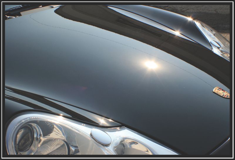
Ive been trying to come up with some new things to add to my business as well as my image lately, I came across one of Todds'(Esoteric) threads and really like what he did with his border. Ive also seen Todd Helme do something of this sort. Well I got bored today and this is what I came up with, any constructive criticism is welcomed.


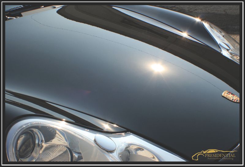
I am still up in the air with the watermark, Im thinking it may be a little over the top..counting on you guys to help me out! ;)
imageborder.jpg


imagebordercopy.jpg
 
What do you guys think about this one?

I made "Automotive Detailing" a bit more pronounced and instead of a white stripe i made it a very light grey.
imagebordercopy-1.jpg

I like this one.

One word of caution - the auto emblem here (and on the BMW shot) are copyrighted and you could be "asked" to remove it. Try cropping the image to eliminate it.

Place your logo over a completely dark section - see the right end in your image.

Regards,
GEWB
 
I like this one.

One word of caution - the auto emblem here (and on the BMW shot) are copyrighted and you could be "asked" to remove it. Try cropping the image to eliminate it.

Place your logo over a completely dark section - see the right end in your image.

Regards,
GEWB

Ive never heard of an auto manufacturer making you hide the badging on their vehicles for taking a picture of it? Look at all the professional photographers, you never see any blurred badges. As for the logo in the dark section, I would have to make the image border way to large to make the logo fit properly and still be readible. I may eliminate the logo altogether though, atleast on forums.
 
Re: badging, while not common, some companies have "requested" removal from promotional materials - I just mentioned it because I know it has happened.

As to your logo, I wasn't thinking about placing it in the border, more like moving it up and to the left.

Regards,
GEWB
 
When you say water mark are you referring to the swirls in the hood? :p j/k Billy!


I'm not sure the border is needed, but I definitely like the logo. :thumbup:
 
Your logo and the border personalizes the photo and reflects a better visual image of your work to possible future customers......

I like the combo you chose....


Just curious, is this logo already taken........:D

1913seal.jpg
 
Your logo and the border personalizes the photo and reflects a better visual image of your work to possible future customers......

I like the combo you chose....


Just curious, is this logo already taken........:D

haha, yes its taken, its actually my logo, I had it designed. :)
 
150% thumbs up on the watermark. Small enough that it doesn't take from the pic, big enough to be noticed and totally classy! I'd use you, just for the watermark!!! LOL

All the borders looks great IMO.

Your logo and borders match your amazing work product. I'm fully on board (although it will now be much more difficult for me to keep showing your details to my friends, as though they are mine).
 
Back
Top