New look? Do you guys like it?

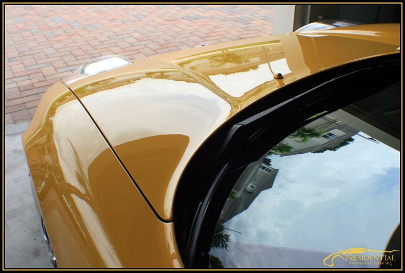
The more I look at it Billy , the more it's the one for sure.

;) Im going to do my best to come in tomorrow! I just got back in town from Orlando.

150% thumbs up on the watermark. Small enough that it doesn't take from the pic, big enough to be noticed and totally classy! I'd use you, just for the watermark!!! LOL

All the borders looks great IMO.

Your logo and borders match your amazing work product. I'm fully on board (although it will now be much more difficult for me to keep showing your details to my friends, as though they are mine).

Thanks! Im excited to post up my first article with the new borders to see how it looks as a whole. ;)
 
Ok just came up with another idea, not sure if I like it as much as the white, but what do you guys think?

test-1.jpg


Heres another example on a lighter colored image that doesnt match so good as the spa yellow nsx! haha

test1-1.jpg
 
I like the logo and would vote for keeping it as a constant (kodo's to it's designer). I'm not a graphic artist and do not know how easy it would be with the software tools you use, but if possible, make the color band within the black border match the color of the car in the photo...kaboom.

$.02
Jack
 
You might want to consider adding a "shadow" to the logo in a dark color. That way, light backgrounds will show up because of the shadow and dark backgrounds will pop the logo.:thumbup:

In my opinion, the black and yellow border is excellent. Back in art school (bachelor's degree in Art Education... how'd I end up a construction manager?).......one of my professors told us daily... "If you want to make it look better, put a BORDER around it!!!"

you wouldnt believe how much work is involved doing that to every picture, Im not too worried about my logo popping off, most people will know what it is..Im actually thinking of taking it out completely so I dont get in trouble on some of the car sites...
 
Back
Top