Thoughts on business card?

anarchistchiken

New member
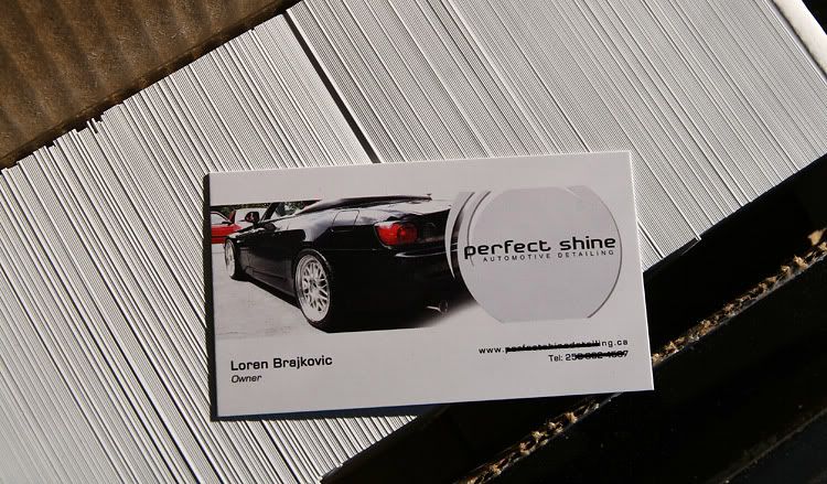
Here's the card I designed, tell me what you think

360%20Detailing.jpg


I'll add the website address once it's up and running.
 
I would include your web address (of course once it's up and running) and Move the Phone/Full Service line further down...almost right on top of the email line.


Looks clean though, nice job.
 
anarchistchiken said:


For someone who knows that the pic is a Ferrari 430, you may want to use the 360 which is the model prior to the 430. have you considered a two sided card? I feel that you can keep the card looking cleaner and offer clearer info.:woot:
 
Neither do it for me.


The 360 logo just isn't convincing at this point...the "detailing' being the weakest point IMO. The images of the Ferraris (do you own these images?) are overwhelmingly the majority of your focus...looks more like a dealership card.


and then there's text justification :)
 
thesacrifice said:
Neither do it for me.


The 360 logo just isn't convincing at this point...the "detailing' being the weakest point IMO. The images of the Ferraris (do you own these images?) are overwhelmingly the majority of your focus...looks more like a dealership card.


and then there's text justification :)


the same. I like the look and feel off the blue ferrari card.


I woud reverse the sizes for the car and the logo. Make the logo much bigger and/or the car smaller.


you have great shapes within the 3 and the 6 and the 0. Make sometihng from that
 
My only tip for you is to make sure you make the canvas larger then the card itself, if you get them professionally printed, it will come out like CRAP.
 
I like the Blue Ferrari version. It's artsy enough to be eye-catching and the Ferrari image imparts a message of quality. My personal preference is to stay away from actual-photo business cards - that seems more like something for coffee mugs or computer mouse pads. I would agree with having them printed. An inkjet printer will only get you so far. Maybe in #2 above you could insert the web address in a tiny font in the upper right to balance out the card. If you have a website that exudes quality and really tells your story, you want to drive people to it.


When you get your new cards, take a stack of them to the next Ferrari club meeting if they will let you give a short presentation.


Something else I recently saw that I thought was clever was a business card holder mounted on the outside of a service van. It was clear plastic with a cover, and allowed anyone curious enough to get a card from the holder that was stuck onto the front fender. Again, this was on a professionally painted van that projected a real quality image. Not for everyone - just an idea.
 
from your original version - i was going to say move the 360 and resize it - but I agree with the comments after that I think you lose the focus on your name and the car becomes the focus - that isn't necessarily horrible but you want your Name to stand out most.

I also like the top card because of the size of your name and number - always better to have a 10 digit number as opposed to 7 - although I do like the both photos -

Make it more about you - don't let the car steal the show. . . the car is nothing without 360 detailing ! haha


you need to get that web address goin!!


More versions!
 
teecster said:
My only tip for you is to make sure you make the canvas larger then the card itself, if you get them professionally printed, it will come out like CRAP.


teecster- Have you ever driven by the 360 Federal Credit Union out by Bradley? I think his 360 is the exact same logo. :har:


+1 for using your own image rather than something you borrowed off the internet. A two sided card will clean it up alot without increasing the cost too much on an already cheap and necessary item. Always include your area code, you never know how fast/far word travels.
 
I like that you used a 360 ferrari! Glad to see my input was of some value. If you can, I would use the back of the card as well... Others have stated the back having a key role in continuing the info you present. I have a guy that does all printed material for me, and he could do your cards. You may want to talk to him. His name is Camillo and the website for his company is www.webprinting.org. Best of luck!
 
Okay, after taking everyones comments into consideration I started from scratch. Legal remafications aside, It's betters to use a real picture anyway, and the ferrari's didn't have enough empty space in the original versions so they were hard to work with.


10 digit phone number will be added, just too lazy right now

360%20business%20card%203.jpg
 
Ok, after thinking about it I decided to start from scratch. This is my car, nice and shiny. Versions 1-4


#1

360%20business%20card%203.jpg


#2

360%20business%20card%203%20v2.jpg


Squished to meet dimensions


#3

360%20business%20card%203%20v4.jpg


Top cut off to meet dimensions


#4

360%20business%20card%203%20v5.jpg


Bottom cut off
 
I'll be brutally honest...


I don't like anything about the card, as a business card.. the Ferrari ones looked good as posters... you're emphasizing the type of car WAY too much in cards like these... it's better to show half a hood, or a faded shot of a car while having a good design and putting enough info (logo/name, your name, phone#, site) around it...


here is a card I really like with cars in the photo...

Picture-6.jpg


and one I do not like (although I own a gorgeous yellow E36 M3 haha)...

businesscardiw3.jpg


and here's mine which a lot of people seem to like, but I'm not 100% satisfied yet...

front:

normal_frontdoneautopia.jpg


back:

normal_backautopia1.jpg
 
Back
Top