Navigation
Install the app
How to install the app on iOS
Follow along with the video below to see how to install our site as a web app on your home screen.
Note: This feature may not be available in some browsers.
More options
Style variation
You are using an out of date browser. It may not display this or other websites correctly.
You should upgrade or use an alternative browser.
You should upgrade or use an alternative browser.
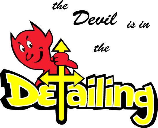
Think I've settled on a name/logo, need your input...
- Thread starter blackntan
- Start date
Prometheus
Perfectionist in Rehab
:up I like it. Best of luck to you.
ScubaStevo
New member
I' m sorry, I don't like the overall design.
What message exacty are you trying to get across, and what's your company actually called? That there sounds more like a strap line to me but I'm not sure I get what it's supposed to mean.
What I'm trying to say is if autopian people don't really get it, then joe public isn't going to have a chance.
Good design though, I just think it needs a bit more focus/direction.
Ben
What I'm trying to say is if autopian people don't really get it, then joe public isn't going to have a chance.
Good design though, I just think it needs a bit more focus/direction.
Ben
PerfectFinish1
New member
After reading your other thread, I do like the overall logo a lot. It looks pretty bright and pleasant... instead of dark. Some people may not go for the name... but if you like it, I'd go with it. Good luck!
Thanks for the honesty guys,
I can't believe none of you have heard the quote:
The devil is in the details....
It's a staple of most 'detail oriented' jobs that I know..
It just means that the success of the job depends on the success of the smallest parts...
Just like in detailing..
But I guess if no one knows what it means, it doesn't do much good, no matter how much I think it's relevant..
Guess I should keep thinking... But this one's not dead yet.. If anyone has any idea on changes they'd make, please let me know..
Oh, and it was made in Adobe Illustrator...
rollman
Professional Detailer
Pretty kool looking logo , its bright and clear. I never heard of that saying .
How bout Jersey Devil Detailing you could still use the logo. I will say I'm not to keen on the T nor do I think it would go over good with the religious people . Perhaps you could use the tail of the devil some how as your T . (Just a thought.)
How bout Jersey Devil Detailing you could still use the logo. I will say I'm not to keen on the T nor do I think it would go over good with the religious people . Perhaps you could use the tail of the devil some how as your T . (Just a thought.)