revised logo! feedback needed!

blackntan

New member
Yeah, so I've redone the logo since last time. (for anyone new, i'm starting a side business detailing cars, simply because i'm getting so many requests after they see my cars that I don't have a choice.. And besides, who can turn down free money...)


Thanks for the honesty, it really helped.


However, I've decided to stick with the same theme, except this time I've cleaned it up, got a real name, and made everything a little prettier, I think..


So, have a look, and gimme some feedback...
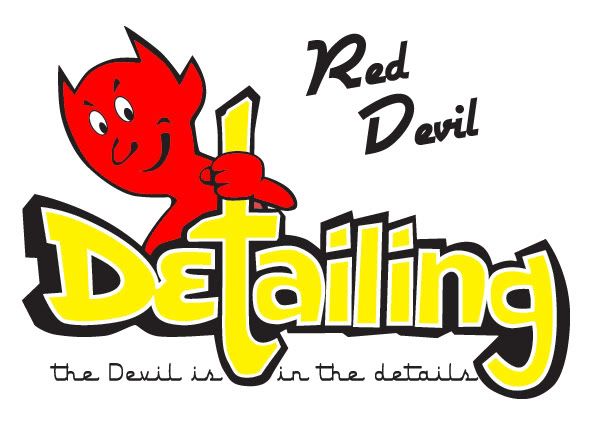


reddevildetailing.jpg
 
Looks good . The name is alot better then your last one . I see you changed it to your sloga,n it looks good in that spot . Before you commit to that ask some friends if they ever heard it . That way you'll get some type of a gauge as to whether or not people will understand the meaning . Print the logo out and show it to some of your Christian friends . Good luck
 
The "Red Devil" text looks a little detached, maybe remove the slant and put both words on the one line?


I like the strapline :)
 
Interesting they way Otravez saw it. The devil is holding a cross. Just what are your trying to convey?............hhhhhmmmmmm SATAN:angry !!!!!!!!!!!!!!!!!! (Church Lady voice)


I like it a lot. Nice play on words.


I would change the "T" so it isn't a cross. Maybe make it a pitch fork or something? :nixweiss


Or, change the location of the devil.


I think most people would not be offended though
 
"God is in the details" is a very well known slogan; substituting â€ËœGod with devilâ€â„¢ might be a problem with some people. I didnâ€â„¢t get a connection with the t + â€Ëœtail and a cross though.
 
I liked it, but think the T should look less like a cross. Nothing wrong with the devil aspect, but the cross is a no-no. I would put the T the same size as the rest of the text and get the devil to hand polish the top of "Detailing". Good work, though!
 
Back
Top