whiteglove
New member
Ignore the bad quality and difference in names.


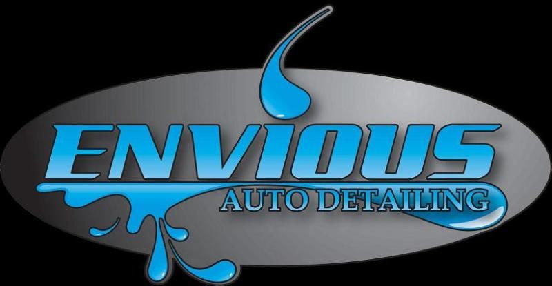
Could you guys give me some feedback on my logo/fonts/proportions.
I like the font on the second one the best but I would be interested in other opinions. I think a solid font could look better but I haven't found one I like yet. My basic idea was to make a versitile logo that wasn't too serious. I like the simplicity because it makes it cheaper to reproduce. I would like to hear some suggestions though.
This is for a Semester long Venture Summary in an Entreprenuership class but I am seriously considering using this idea as a real business.
This forum has been an invaluable resource for this project and for myself as a detailing enthusiast. Thanks guys.
:thx
") . Another thing I forgot to mention is that when you're making a logo, you also have to take into consideration what it's going to look like on things like a business cars, shirts, vinyls, etc. I'd try to stay away from the black background if I were you as it may give a bit of a negative feel to the logo as a whole. Instead, I'd put the glove into a black oval or a circle and leave the background white. Just my thoughts!
. Another thing I forgot to mention is that when you're making a logo, you also have to take into consideration what it's going to look like on things like a business cars, shirts, vinyls, etc. I'd try to stay away from the black background if I were you as it may give a bit of a negative feel to the logo as a whole. Instead, I'd put the glove into a black oval or a circle and leave the background white. Just my thoughts!