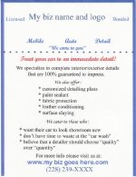
please critique my flyer

jason rawls

Weekend Warrior
Hey guys I'm looking for a little constructive criticism on this flyer that I will be placing door to door in "select" nighborhoods. I have'nt copyrighted my name or logo so I'm a little reluctant to post it (no disrespect to anyone - just covering my butt), but it does spruce up the flyer a lot. I went with the simple approach here - short and sweet, not too many words. What are some thoughts here?
 

Attachments

  • scanned flyer.jpg
    scanned flyer.jpg
    43.3 KB · Views: 211
Only thing that jumps out at me is the "*don't have time to waste at the 'car wash'" phrase... Usually a good detail will take much longer than just a car wash so, I dunno if that would be a good thing to put on your flyer. Oh and try capitalizing some of those sentences.
 
I like it, but it doesn't seem very professional to me. JMO. I would also try to give a more detailed approach to telling them what you do.
 
I dont think I would put quotes around quality and quantity. The car wash statement does make sense. The person taking their car there has to spend the time driving there and back, and sitting there just watching other people work on it. As a mobile detailer, the work is done while the client can do their own work in their house or office.
 
Not too bad, but just remember your target market. Those people might not know what paint sealant or clay bar is. Of course you, and the other people here on the board know, but probably not your average Joe. Focus more on sensory words and adjectives in your flyer. Things such as: "Your paint will shimmer after advanced 4 step method". Of course you don't want it to sound too hokey and infomercial-like either. Try and find a good balance.


Also if you're putting out flyers in a certain area and see someone tell them "Hey the first person that calls on this street/neighborhood etc. is getting X discount." Once you get a foothold and Dr. Snooty gets his car done, I'm sure many will follow.


Also remember if your flyer is only going to be used to get them to go to your site, mention your site has coupons, discounts, or specials (and have lots of pics of course). Also rotate those specials frequently and put an expiration date on them to get people off their cans and call you. Good luck, hope this info is useful to you.


Wax-on/Wax-off
 
Also, capitalize the letters after the asterisks to make it easier to read. You can use more spacing to make it more friendly to the eye.
 
All good suggestions. I agree that it is a little unproffesional, but my name and logo includes a picture which helps out a little. Any suggestions on how to spruce it up a little - I'm lacking in the creativity department. I didn't want it to be too crowded with a lot of information, I don't think that very many people will read too many words. Is the whole "we cater to those who:" section a little too corny - maybe I should use that space for something else. Any more suggestions? I would like to see some of your flyers for a few ideas - I promise not to blatantly copy anything. My e-mail address is jasonrawls@bellsouth.net. Thanks!
 
I agree, I would switch those to a spot where you give a breaf description on what you do to the cars, or what you include in different packages.
 
Back
Top