New look? Do you guys like it?

Ok just came up with another idea, not sure if I like it as much as the white, but what do you guys think?


test-1.jpg


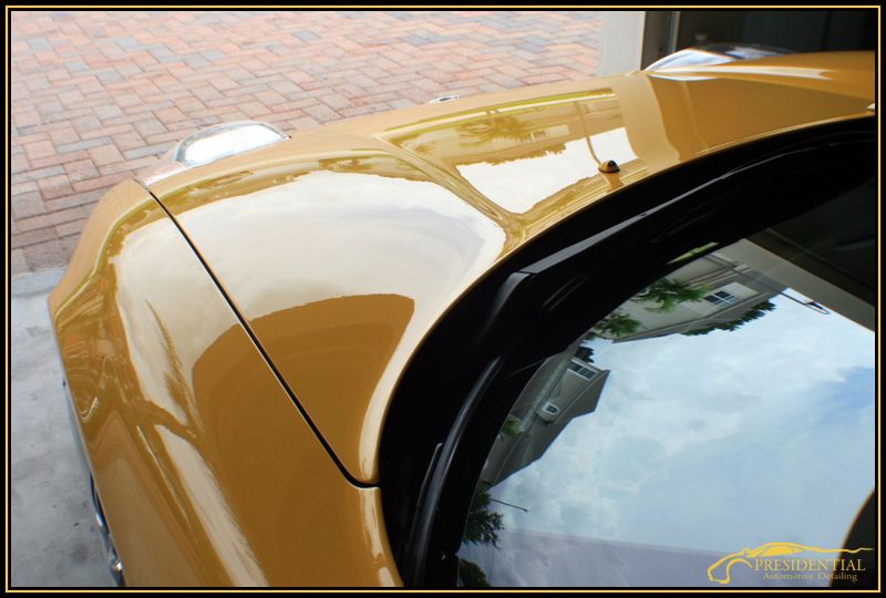
Heres another example on a lighter colored image that doesnt match so good as the spa yellow nsx! haha


test1-1.jpg
 
The clean flowing lines of the stylized car look great and send out a message of high professionalism. The only problem I see is that your company name and “Auto Detailing” is hard to read especially against a medium to light background as on your bottom image. You could perhaps fix this by doing a slight burn in the image with Photoshop before applying your logo.
 
fins&chrome said:
The clean flowing lines of the stylized car look great and send out a message of high professionalism. The only problem I see is that your company name and “Auto Detailing” is hard to read especially against a medium to light background as on your bottom image. You could perhaps fix this by doing a slight burn in the image with Photoshop before applying your logo.


Thanks for the input! This is more for when I post my threads than say for a website gallery so Im not too worried about the "auto detailing" showing up completely. Not to mention, people who open my threads will know the name, so it will or SHOULD click in their heads what it says underneath. Its hard enough just to edit all the photos with this border system, adding burns and such to "certain" pictures I think would be wasted time. Im more concerned with the overall look of the actual border rather than my watermark.
 
Yeah, that`s the thing. People will come to recognize the silhouette of your stylized car and associate with your company name. For what it’s worth, you should stick with a white or very pale warm grey for the border. That way, the yellow in your logo gets no visual competition. good job!
 
Back
Top