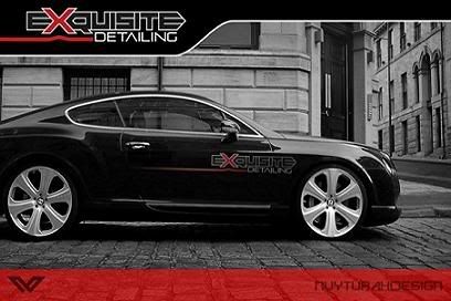
My Business Card

Re: B.c

I would off set your name and contact info to the right side and smaller..also change the color to reflect the same as the T-Mac
 
Re: B.c

Beemerboy:thanks Anyone else have thoughts on how I could improve my Business Card?

I think a more subtle vehicle in the background might help ..the truck color grabs your eyes and you really can't focus in on the words :)
 
Re: B.c

I agree with poorboy, I think the silver truck along with the chrome on the tail lights distracts from your business name and number....maybe a black vehcile and set your name off to one side.
 
Re: B.c

I'd have to say I agree with Poorboy. For doing it yourself you're off to a good start but the truck does make it very hard to read your info.

I'd suggest screening the truck back which would allow your info to 'pop' more...or you could make a bold strip through the middle of the card horizontally and leave the truck in there as it is and then put your logo up top and your contact info below.

Sorry for the lengthy reply...I do this by trade so I thought I'd give you my .02¢ worth.

Hope it helps ya.

Here are a couple cards I've designed which might offer you a few examples...

cards_addicted.gif


cards_sharp.jpg


Good luck and don't hesitate to ask if you've got any questions. As I said...nice work and props for doing them on your own.

:bigups:bigups
 
Re: B.c

Here's my new B.C. guys!!! Let me know what you think.

cards_tmacs.gif

I've had them for awhile now just haven't had a chance to post them.
 
Re: B.c

Looks good Tony :bigups
Nice clean professional appearance.

Just one thing, unless someone is savvy they may not realize that your address is also your website.
Just a thought for your next printing to add that
 
Re: B.c

Very nice.:bigups

Being an amatuer desktop publisher myself, my cards have gone through a progression a lot like yours have. I started out wanting a card with a car plastered across the whole thing and laying the words over it. I finally realized that the car was competing too much with the words for your attention.

I think it's important to develop a style and/or logo and use it for everything. Marketing has never been my strong point but after 18 years I have developed it a little.:redface:

BTW- Do you mind if I change the name of this thread to "My Business Card" or something like that so people know what they are clicking on? ;)

Go for it Troy. :bigups I also agree with you about the style and logo very important!!!
 
Here is the front and back of mine, a graphic designer designed these. He kind of messed up the bottom red banner, it was supposed to be lower but o well.. Next time i order more cards it will be fixed. Let me know what ya'll think

EXQUIS_FRONT.jpg

EXQUIS_BACK.jpg
 
I :love: it.

I like the way the photo is a black-n-white with the old buildings in the background:bigups

I also feel you have your info tastefully done....:rockon
 
Back
Top