Feedback on this logo please

Thanks guys--the name stays as it has been my name for years--also would have to change my website address. :)


I just wanted to develop a logo--who knew that it would it turn out to be this kind of an ordeal. :D I will work on it some more with friends, perhaps something will "pop" into my head.
 
I am with Accumulator on this one. Location depicts the usual use of certain lettering. Around here the Old English style fonts are usually flaunted by "thuggish" characters. And personally I do not like the Old English styling as I find it difficult to read at first.


I do like your idea of being different in some regards but remember you can show class by having a nice clean logo/font. It doesn't have to be elaborate.


Good luck going back to the drawing board.
 
While I understand where the thuggish association comes from in regards to the text, I think the "medieval" imagery above brings it right back to its origin. That's just me though.


One thing about the logo is that it's not immediately recognizable as belonging to a car detailar, but it's a very strong logo and once it's known, it will be easily distinguished and its far better than a shiney sillouette of a car or a couple of buckets for a logo.


I guess looking back at the potential customer. A lot of folks in the automotive world seem to appear tacky graphics with every font beveled or embossed ontop of a tribal logo...don't know what the appeal there is, but look at some of the banners car organizations have or at car shows and it's immediately apparent. I guess what that means is a professional logo has its place......


Hope I didn't confuse you, food for thought.
 
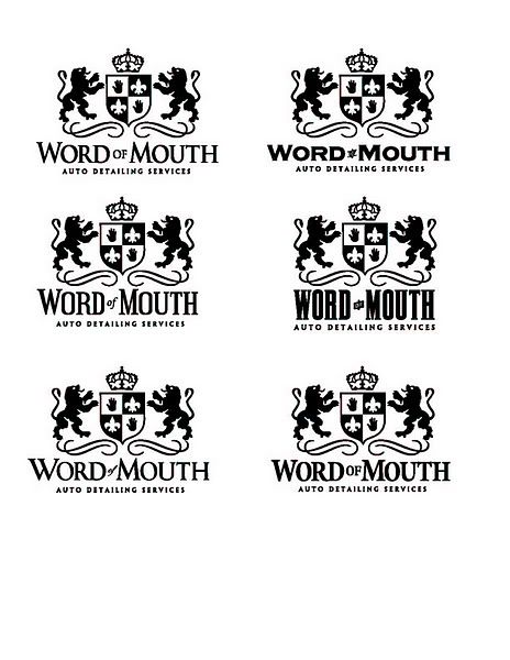
Would using one of these more plain fonts help guys?


tn_wordofmouthOPs.jpg
 
Yeah, either the first one (upper left) or the last one (lower right). I kinda like how theh "auto detailing services" looks bolder in the last one.
 
Accumulator said:
Yeah, either the first one (upper left) or the last one (lower right). I kinda like how theh "auto detailing services" looks bolder in the last one.


My initial thoughts were to use the first "WOM", but use the last "Auto Detailing Services." :D


Thanks guys!!!
 
Personally Joe, I'm not feeling the whole coat of arms vibe. I think it's more for a dinner at Medieval Times or on a bottle of a German beer. The hand image in the shield is clever though.


If I were to pick one (let's see if you can follow this), I would choose the bottom left, with the word "of" from the middle left, and the wording "AUTO DETAILING SERVICES" from the middle right.


The logo is definately different as far as typical detailing ones go; usually the cheesey Porsche or Corvette pic and the high tech looking font. What I like about it, is the refined image you are going for - clean simple, black and white, understated but gets the point accross. I'd remove the Saints logo and put in another detailing image like the hand. That'll be clever in my opinion.


Good luck with it though! I think you're off to a great start. Whatever you choose, it'll be your killer workmanship that'll count.
 
Back
Top