Critique my Business Card!

OCKlasse

New member
Hey guys, just as the title says. I need a little critiquing before I send out the cards to be printed. Constructive criticism is welcome, and be tough! I know I need to fix a few tiny things (the picture will get moved over) but let me know if you would want a detail from me by seeing this :dance


BusinessCardJPEG.jpg
 
To be frank, a picture of a tire and wheel assembly wouldn't motivate me to call you to detail my vehicle. If you were in the tire business, it would probably be okay


A pic of a detailed, swirl free car would probably do the trick.


I would consider a two sided card... one side with the pic and your company name and number, the other side with the services you provide.
 
First, I'd like to preface that I'm not a pro. detailer, but if I were a potential customer and I saw that card, here would be my thoughts:


1) Elite Detailing Syndicate - It doesn't sound professional to me. It makes you sound like some mob boss or something.


2) Automotive Enthusiast and Perfectionist - Again, not professional IMO. Just about any car forum member considers themselves to be enthusiasts. Anyone can claim that title, but it doesn't mean you know jack squat about detailing vehicles.


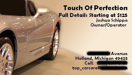
3) I think the picture is just ok. It can be improved upon like others have said. Also the card doesn't really stand out because all the type is in black. Maybe spice it up with a little color.
 
The "detailing syndicate" thing is a bit confusing. What's it supposed to mean? Typically a syndicate is associated with a group of criminals and thieves, I'd find another word if I were you.


Also, "Automotive enthusiast" imparts the idea that you are a car guy who is doing some detailing on the side, not really a professional. At least that would be my first impression if I was handed that card.
 
Actually, I like your card and I would not change anything. It has all of the important information; the name of your company, your name, exactly what it is you do and your contact information. Get some printed up and get them out there!
 
why not add a little classiness to the card before print?? it will appeal to others more! boring advertisement, or intriguing advertisment....you make the call
 
As a deisgner, I say the all caps loking font is rather hard to read. Generally if I cant read your card first glance it gets tossed. Thats just me, I dont have time to squint and concentrate to find you can wash and detail my ride.


Needs more color too. ALOT MORE!
 
Thank You so much guys for all the help! Sorry I have not gotten here sooner...I had no power for 18 hours :think: ...but I will take all the advice, and hopefully soon, I will draft a better one :)
 
Hey guys, is this one any better? I still have to put my rates on the other side, but what do you think? (my car by the way)


photo.jpg
 
um. nice framing for the shot, but you can't really get the 'details' feel from the pick.


I'd say get a couple flood lights, shine em on those huge rims, and take the pic again.... Or take it during the day.
 
I like the card in post #15! Very nice improvement over the original. I would just suggest to maybe move your name and the owner part a little more in the lower right hand corner.
 
Joshua312 said:
I like the card in post #15! Very nice improvement over the original. I would just suggest to maybe move your name and the owner part a little more in the lower right hand corner.


thanks for heads up! I can move it down, but I think I have to take away the owner and operator part of it...but I think you are right, it looks significantly better in the corner
 
I know this is negative and it is just my opinion.


I don't like the name "OC Prominence Detailing".


My business name sucks also, I didnt put any thought into it, its my username.


In post #15 - get your number and name closer.
 
jsatek said:
I know this is negative and it is just my opinion.


I don't like the name "OC Prominence Detailing".


My business name sucks also, I didnt put any thought into it, its my username.


In post #15 - get your number and name closer.


I was thinking of OC KLASSE...but I don't know...is that any better?
 
Back
Top