Sorry, I know there are a lot of these. 
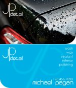
What started out as a side job I did out of my parents house for friends has blossomed into an occupation, so as such I now need business cards. I whipped this card up tonight, and I was hoping to get the opinion of ye kind Autopians. I tried to keep it simple and modern. The front (picture) will be gloss, and the back will be matte. I don't know if I'm really satisfied with the logo...
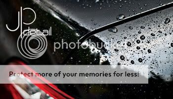

What started out as a side job I did out of my parents house for friends has blossomed into an occupation, so as such I now need business cards. I whipped this card up tonight, and I was hoping to get the opinion of ye kind Autopians. I tried to keep it simple and modern. The front (picture) will be gloss, and the back will be matte. I don't know if I'm really satisfied with the logo...

")
")