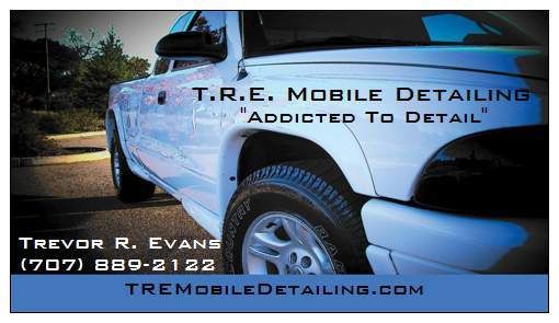
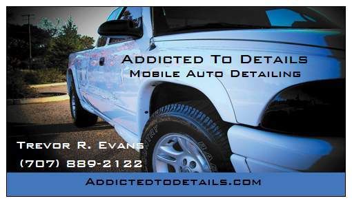
Hope you don't mind if I offer my 'professional' opinion, since I'm a graphic designer.
I think the layout is a bit busy. The company name gets kind of lost over the truck. Maybe try adding a white border around the text and make it a bit bigger/bolder. Depending on the software you used, you could put a slight fade over the picture to allow more contrast behind the company name.
There's always the option of putting the picture on one side or the other and having you name and contact info on a solid color background for easier readability.
What you have is nice...just a little busy. As I said, it's just my professional opinion...take it however you want.
I do this kind of thing for a living, so I'm critical of design like you all are critical of a perfectly detailed car.:crazy2:
Here are a few samples of cards I've done to maybe help spark some more creativity...
http://tmooregraphics.com/media/cards_HPP.gif
http://tmooregraphics.com/media/cards_larimore.gif
Also...a very nicely designed 'logo' can really set you apart from others, but there's quite a bit of cost involved in a professional brand image.
Good luck...I'm anxious to see what you end up with!


")