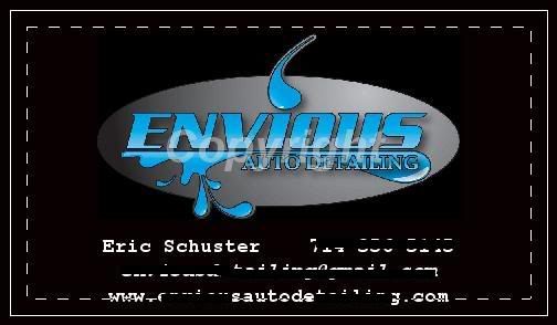
I know you already purchased your domain name but you may want to reconsider the spelling of your name. The "x" and the "z",mainly the "x", could cause issues when you have a website and potential customers try to find you through search engines. Or some o e hears you name but is unaware of the unique spelling choice.
Navigation
Install the app
How to install the app on iOS
Follow along with the video below to see how to install our site as a web app on your home screen.
Note: This feature may not be available in some browsers.
More options
Style variation
You are using an out of date browser. It may not display this or other websites correctly.
You should upgrade or use an alternative browser.
You should upgrade or use an alternative browser.
Business Cards...What do you think about mine?
- Thread starter a_guerrajr
- Start date
RustyBumper
New member
I would change the word reflections to its proper spelling and choose a different type of font. As a consumer, I tend to stay away from businesses like this. It makes them seem as they are fly by night operations and don't invoke a whole lot of confidence.
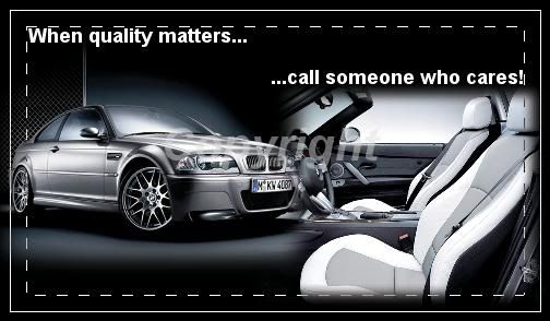
The colors and choice of cars are nice. Maybe you could list on the back of it some of the services you offer, with bullets.
The colors and choice of cars are nice. Maybe you could list on the back of it some of the services you offer, with bullets.
a_guerrajr
New member
Hmm....
Reflections sounds so boring and repetitive.
Reflections sounds so boring and repetitive.
a_guerrajr
New member
I might change the X , but i do like the way the Z rolls off
I'm going to be brutally honest here. Whenever I'm looking for services, I look for a business that appears to be run well and presents itself accordingly. I would not call you if I received your business card for the following reasons:
1. The name of the business goes the extra mile to misspell a simple word, and it gives the appearance of a 16 year old starting a business on the weekend. Seriously, this would go in the trash before I turned it over to read the back, and there's no way in hell I'd consider dropping off my car based on this first impression.
2. A simple logo and contact information is much more impressive than photoshopping a random luxury vehicle as the focal point of the card. All I see when I look at this card is the photo...your business name is very secondary.
Business cards like this kill me, because they are a wasted opportunity. Put the name, a clean logo, and your contact info on the front of the card. If you want something on the back, put something meaningful back there, and skip the added graphics. Put a simple price list there, define auto detailing, place a "did you know?" type of attention grabber, or something else that someone would care to read.
Please don't take this personally - just trying to help. Less is more.
a_guerrajr
New member
15951 said:I'm going to be brutally honest here. Whenever I'm looking for services, I look for a business that appears to be run well and presents itself accordingly. I would not call you if I received your business card for the following reasons:
1. The name of the business goes the extra mile to misspell a simple word, and it gives the appearance of a 16 year old starting a business on the weekend. Seriously, this would go in the trash before I turned it over to read the back, and there's no way in hell I'd consider dropping off my car based on this first impression.
2. A simple logo and contact information is much more impressive than photoshopping a random luxury vehicle as the focal point of the card. All I see when I look at this card is the photo...your business name is very secondary.
Business cards like this kill me, because they are a wasted opportunity. Put the name, a clean logo, and your contact info on the front of the card. If you want something on the back, put something meaningful back there, and skip the added graphics. Put a simple price list there, define auto detailing, place a "did you know?" type of attention grabber, or something else that someone would care to read.
Please don't take this personally - just trying to help. Less is more.
Thanks for the tip. i will highly consider the feedback.
none taken. that's why i am asking.
i guess i can get carried away since i like to do design, but i am trying to stick to a simple and clean card.
:woot2:
a_guerrajr
New member
What do you guys think of these???


Back of the car is ok. I think that tag of "Not Just A Car Wash" could use a bit of spicing up.
As for the Front.. doesn't really do it for me. Those catch lights really distract from the name and make it hard to read and don't really reflect (no pun intended) on your business.
I think this is a good explain of applying the "less is more" approach.
As for the Front.. doesn't really do it for me. Those catch lights really distract from the name and make it hard to read and don't really reflect (no pun intended) on your business.
I think this is a good explain of applying the "less is more" approach.
a_guerrajr
New member
paco said:Back of the car is ok. I think that tag of "Not Just A Car Wash" could use a bit of spicing up.
As for the Front.. doesn't really do it for me. Those catch lights really distract from the name and make it hard to read and don't really reflect (no pun intended) on your business.
I think this is a good explain of applying the "less is more" approach.
:xyxthumbs
i think that is the way i'm going for. i'll update this once i change stuff around.
i'm so use to making heavy graphixs that i can't do simple stuff

Envious Eric
New member
got print . net
design and print and have them shipped to your door for cheap!
design and print and have them shipped to your door for cheap!
Envious Eric
New member
Keep it simple
a_guerrajr
New member
Cintoman said:I think this was mentioned earlier, but the reflection of the word "detailing" is not right. It's not a true reflection. This is especially noticeable with the "E".
Cintoman
yes. that is one thing i'm fixing.
John_K said:Hey man,
If you don't mind telling me, where are you designing your business cards? I am actually nearing this step and would love any guidance.
i design myself, then i use vistaprint.com for actual printing.
a_guerrajr
New member
How about this .....?


Envious Eric
New member
I hate the estimates on cards...its a contact piece, not a work order. IMO
a_guerrajr
New member
toyotaguy said:I hate the estimates on cards...its a contact piece, not a work order. IMO
:LOLOL
:thx
a_guerrajr
New member
I think this is what i will end up going with.
Easier to read IMO
Cuts to the point..


Easier to read IMO
Cuts to the point..