Business Card Ideas?

Robert

5 bucks off of a car wash might be good but on a 150 buck detail?

I would use % off, sounds like more and you can change the prices according on any job that comes in
Ya I was gonna go with $5 off or %10 I have found that the consensus has been %10 percent. Thats why I'm glad I put it out there. Thanks for the input
 
here are what the new one looks like I took the orange strip off
gdetail_busi1.jpg
 
I like the card. One thought came to my mind. If I were handed this card not knowing what you did. I would have to give it some consideration to know for sure what you are offering. I believe this could be easily remedied by adding the word "Auto" or "Automotive" before "Detailing". Then again, that is probably adding a word that isn't in you business name.
 
that is an issue that I thought about myself, but the name is Gainesville Detailing so I'm not sure about what I should do.

Maybe a little blurb down above the menu of items you provide that says something to the effect, "Premium Auto Detailing" in small text like the menu. Perhaps under your web page address or centered below the bottom text.
 
What about locating it at the bottom:

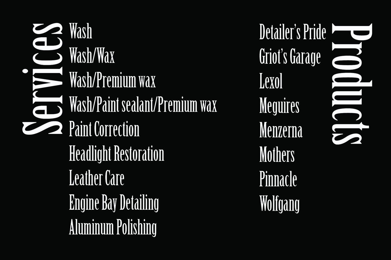
Premium Auto Detailing Services: Full Detail, Exterior, Interior, Odor removal
 
I'm unable to see any of the pics that have been posted of your card. Is anyone else having this problem?
 
I'm pretty sure wherever he uploaded them to doesn't have the files anymore. They were hosted by his domain, so unless his webhost is having issues, I'd say he removed them from the folder.
 
Thanks Dave and Tony for the kind words on my work. I've done business with a number of 'detailing' guys both here on DC and locally.

Here are "my" new TMoore cards along with a couple others...just for ideas.

new_cards_1009.jpg


On this card, it's got a matte finish and then I did a glossy 'spot varnish' over the blue logo and text which is hard to see in the pics. It's also all matte black on the back and I did an illustration of a Lotus that is also printed in 'spot varnish' so it's there but just subtle. It's a little more cost to set-up and print, but the end-results are uber-cool and the customer (and myself) was totally thrilled with them. ;)

A2D_back.jpg


AtoD_card_back_09.jpg


Anyway...as for your latest cards, they're not too bad...a little too busy for my taste though. There's so much going on it's hard to know where to look and there are way too many 'fonts' competing with each other. You want your card to be simple, clean and allow your eyes to work around it and see things by matter of importance.

A few suggestions...
- limit the use of so many fonts...there's medium, bold, italics and then the 10% off graphic has it's own look to it. My eyes just don't know where to look first as there's so much going on. ;) Give your info some hierarchy and let your eyes 'wander' around the card in order of importance.

- pump up the size of the "Interior, Exterior, Full Detail and Odor Removal" text. It's almost 'lost' down there.

- take your name and web addy down a point size or two also and lose that horizontal line in between them..it doesn't offer anything for the 'design'.

- the other thing that bugs me is the phone number...it looks 'cooler' than your logo with that gradient. A business should have a catchy 'logo' that makes them stand out and be unique and at first glance my eyes are drawn to the phone number. You want people to know "who you are" more than anything. Yes, the phone number should be easily visible but the name/logo should be most important.

Sorry...after 19 years of doing this professionally, I get a little nit-picky about "graphic design" just as any of you professional detailers are about "detailing" I suppose. Hehe.

Okay...take my constructive criticism as you wish but I'm in no way 'bashing' you. In the end, if it makes you happy then by all means go for it. I just had to voice my professional opinion. :)
 
Thank you for all of your suggestions. I really enjoy the constructive criticism. YNOT those are some sweet looking cards. I am going to take some of everyone's suggestions and see what I can come up with. I will post updates to see what everyone thinks then they are off to get printed. Thanks guys
 
Business cards really should serve one purpose: A source of information.

The problem with business cards today is that people either find what they need in a phonebook or online. You don't see too many people collecting business cards anymore.

How to design one then? Focus on the purpose. Give them as much information as you can that will help them locate and contact you easily. Everything on it should be worthwhile to the client. Put yourself in their shoes and read your card.

I advise this with anyone seeking marketing help on business cards: >LEAVE THE BACKSIDE BLANK< (or at least leave plenty of room for writing).

Some will argue that it's a great idea to put an advertisement on the back. I'm not here to argue. I'll just state why not to do this from experience/facts.

Here are 3 reasons why NOT to put something on the back of your business card:

1. If you ever change your pricing or specials, you'll be expected to honor an ad you sent out a year ago. What if you state the end date of the ad? Still no. You will then have customers that throw it away after that point or you might end up having 100s of cards that have a unprofessional backside ad on them. It will make you look like a fool to give out an ad that is out-of-date.

2. You ALWAYS want to hand a business card and pen to the customer. Tell them to write down some sort of info on it. The customer will take ownership of the card and be more likely to place it somewhere safe and to not throw it away. This is not just a guess. It is proven to increase the effectivness of a business card. You're less likely to have Mr. Jones' Wife find it in the car and throw it away as well.

3. It is more exspensive. Face it, you might misplace your cards, drop some in a pile of goo around your shop. Experience helping others with business cards has shown me that you should buy the minimum as well. There is a good chance you'll want to change the info on the cards after you've had some experience with your customers responding to them.

I would like to add this as a challenge to all of you:
Think about not getting any business cards at all. Today, the most effective "business card" is being in the customer's cell phone. Every customer will have one, and it's not hard to add yourself to it. I've gotten to the point that I just ask to see the customer's cell phone and without them asking I add myself/business to it. Just think about the constant exsposure you will get with that!
 
business cards is part of your "BRANDING " process, it is cheap advertisement,period.
Make sure you spend the money to develop a Logo, A Logo is how people Identify you or your company . Come up with a catchy name , that sets you apart from the next guy.

Also business card, and good quality business cards give you creditability , that you may not be some fly by day operation.

It is also good to put your web site address on your business card. Don't have a web site ......get one. A good web site will bring you business,plus you can have all your info that you "cannot have on your business card "
 
Business cards really should serve one purpose: A source of information.

The problem with business cards today is that people either find what they need in a phonebook or online. You don't see too many people collecting business cards anymore.

How to design one then? Focus on the purpose. Give them as much information as you can that will help them locate and contact you easily. Everything on it should be worthwhile to the client. Put yourself in their shoes and read your card.

I advise this with anyone seeking marketing help on business cards: >LEAVE THE BACKSIDE BLANK< (or at least leave plenty of room for writing).

Some will argue that it's a great idea to put an advertisement on the back. I'm not here to argue. I'll just state why not to do this from experience/facts.

Here are 3 reasons why NOT to put something on the back of your business card:

1. If you ever change your pricing or specials, you'll be expected to honor an ad you sent out a year ago. What if you state the end date of the ad? Still no. You will then have customers that throw it away after that point or you might end up having 100s of cards that have a unprofessional backside ad on them. It will make you look like a fool to give out an ad that is out-of-date.

2. You ALWAYS want to hand a business card and pen to the customer. Tell them to write down some sort of info on it. The customer will take ownership of the card and be more likely to place it somewhere safe and to not throw it away. This is not just a guess. It is proven to increase the effectivness of a business card. You're less likely to have Mr. Jones' Wife find it in the car and throw it away as well.

3. It is more exspensive. Face it, you might misplace your cards, drop some in a pile of goo around your shop. Experience helping others with business cards has shown me that you should buy the minimum as well. There is a good chance you'll want to change the info on the cards after you've had some experience with your customers responding to them.

I would like to add this as a challenge to all of you:
Think about not getting any business cards at all. Today, the most effective "business card" is being in the customer's cell phone. Every customer will have one, and it's not hard to add yourself to it. I've gotten to the point that I just ask to see the customer's cell phone and without them asking I add myself/business to it. Just think about the constant exsposure you will get with that!


I have to disagree with most of that. I hand out hundreds of business cards a year to people who want to pass my information on to other people. Many of my customers ask for my cards to give to their co-workers or other people they know. I definitely don't agree with asking for their cell phones and just putting your number in it. That is a little invasive if you ask me. Besides, I don't want to have to spend face time with a potential client trying to figure out how to use their phone.

My first business cards had an abbreviated price list on it. But then when I raised my prices I had to get rid of that, so I built a website and put prices on that instead. That worked out much better. My cards have my URL, email, phone number, and name on them. That is all the information people need to have. I printed one side glossy with my logo and the back side has my information on it. Sure nobody can write on it, but I've honestly never been in a situation where someone has wanted to write on my card.

I wouldn't look at the minimal cost of double sided printing as anything that would deter you from doing it. If you aren't willing to spend the ten bucks or so more on your order to get double sided printing done, then you aren't really that serious about your business. If you don't want double sided, then that is one thing, but citing the cost as being the reason you don't do it just doesn't make any sense. Go to vistaprint.com and look at what double sided costs compared to single sided. It really isn't that big of a difference. There are dozens of sites you can go through that get you significant discounts with vistaprint as well. Just google "vistaprint discount" and see what you get. I printed my last batch of 2000 cards double sided with gloss on one of the sides and I paid less than $60 shipped.

A business card isn't a price sheet and shouldn't be used as one. Get a website so your email address can be at your own domain at the very least. I know that nothing says legitimate like a hotmail account, but trust me when I say that you will build credibility for your business with a proper website displaying your work and your prices. Your card should have at least your name, email, and phone number on it if not your URL as well. No sense in getting too crazy with other text though. Maybe your business name and a slogan and that is it. You can easily fit that one one side and use the other side for whatever purpose you want. Or leave it blank if you want to, but don't leave it blank because you think people need to take notes on it. I've never seen that done in my dozen years in this business.
 
I've gotten to the point that I just ask to see the customer's cell phone and without them asking I add myself/business to it. Just think about the constant exsposure you will get with that!

That just seems like a bad idea to me, but if it works for ya, go for it.

I personally would not go back to a person that did that to me...especially without asking. If I saw that in my phone, I'd be concerned that if you 'snuck' your phone number in there, then what might you have 'snuck-out'?? It just seems too sneaky.

Being a graphic designer for the last 19+ years, I've seen mixed opinions on front and back printing on biz cards. Many of my clients insist on filling both sides of their cards, but I've had a few (very few) who want the back left blank. Even on my own cards...I use one side for my logo/car image/name and then the back side gets the details about me...address, web addy, phone #, etc.

I look at biz cards like a piece of 'art'. I want them to be something people will want to hang on to, so I create each one like it's 'artwork'...making them appealing and full of color while using a limited color pallet. I see so many people who try to make their own cards when they aren't truly a 'designer' and most people just fill them so full of useless graphics and colors that they're more of an eyesore than artwork.:rofl And don't even get me started on people who use 12 different fonts and make their type so small you need a magnifying glass to read it.:inspector:

The best info for biz cards...keep it simple! Less is more...give them just what they need as far as info, yet make it appealing so they'll want to keep it. Pick a font...(1)...and stick with it. Maybe you can use 2 if you know how to make it work.;)

Over the years I've had many clients keep (collect) my cards because they like them. And I pretty much design new cards every year...in fact sometimes I'll do 2 different ones in a year. I just love creating them and I love something new. Thanks goodness I don't know 'web-work' or I'd probably change my website every day. :lmfao

Okay...I'm done ranting for now.:crazy2:
 
I put one together on VistaPrint just for giggles. But I was impressed by what came out. I saved it to my computer so I can use it as a reference when I go to make an order. They have quite a few automotive-related themes and templates. Here's what I made:

premiumbusinesscard.jpg


Love the stock photo of a California highway in the late 80s, it's a perfect backdrop of the cheap cars I intend to sell. I like the red Bronco II on the right with no grille in particular. With VistaPrint I can change all the text, put on fewer lines, more lines, change colors, sizes, everything. Charcoal gray and yellow works for now, though I might go with red for the highlighted text when it's all said and done, especially if I get the property I'm looking at (old red/white Texaco station set up for a tire shop at the moment).
 
Back
Top