Navigation
Install the app
How to install the app on iOS
Follow along with the video below to see how to install our site as a web app on your home screen.
Note: This feature may not be available in some browsers.
More options
Style variation
You are using an out of date browser. It may not display this or other websites correctly.
You should upgrade or use an alternative browser.
You should upgrade or use an alternative browser.
Which is better?
- Thread starter ZaneO
- Start date
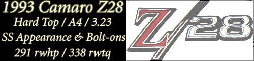
I like the top one a little less distracting without your car in the background.
I'm no PS expert but if you can get the whole image with a black background and a red border would look more uniform. Right now it looks like two completely different images stitched together.
I'm no PS expert but if you can get the whole image with a black background and a red border would look more uniform. Right now it looks like two completely different images stitched together.
Wasatch
New member
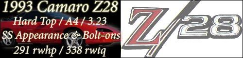
I like the bottom one.
imported_Lenard
New member
I think the first one is better because it doesnt have a distracting background. I have a few suggestions to make it look better:
My 2 cents,
Len.
- Don't have the text so close to the edge, use a border.
- Left align the text, this makes it easier to read.
- Have a blank line between your title (1993 Comaro..) and the specs.
My 2 cents,
Len.
")
BlackSunshine said:BTW, nice numbers!
Eh...they're kind of puny to me, but I guess they're not bad for bolt-ons. I've got a few mods left that I'm hoping puts me close to 320 rwhp and 350 rwtq - 1.7 roller rockers, 52mm t-body, 3.73 gears, and 2800 stall - and should get me close to 12s (5000' DA).