I have a website for my detailing business with a HUGE link to community website that gets 700 hits/day. I am a sponsor. Do you have any suggestions on how to turn the hits/visits into phone calls or e-mails requesting service. My website is www.afinerdetail.com. Thanks for any feedback that anyone can give me.
Navigation
Install the app
How to install the app on iOS
Follow along with the video below to see how to install our site as a web app on your home screen.
Note: This feature may not be available in some browsers.
More options
Style variation
You are using an out of date browser. It may not display this or other websites correctly.
You should upgrade or use an alternative browser.
You should upgrade or use an alternative browser.
Website
- Thread starter ems154
- Start date
SilverBelle04
New member
- Your advertised specials are a little difficult to get to/view as a "Word" file. You might want to bring more focus to the specials on your homepage and make it more easily accessible.
- do you have the right exposure on the community webpage ? if the community page gets 700 hits per day...how many hits does that translate to on page ?
- "We are a mobile operation" as mentioned on your site, might not really say anything to the average Joe consumer. You might want to write a little slogan that says something more direct like "we 'll come to your door and detail your car while you work" or "relax in your lawnchair while we detail your car in your laneway" .....
- you might also want to consider flyer distribution that directs traffic to your website
- agree with the above post RE: very slow pic downloads
- and overall you want to make it easy for clients to do business with you whether its viewing your website and specials to access to services
hope this helps,
Bob
also.. what I would do if I owned a business..
was take some very exaggerated pictures of the paint defects and fixes.. and point out the causes and i think you should try to convince the viewer that their car looks like crap.. (with out saying it) "how you can fix it" idea.. what ever works!
a very organized before/after gallery of client cars would be nice (with their consent of course")
good luck!
was take some very exaggerated pictures of the paint defects and fixes.. and point out the causes and i think you should try to convince the viewer that their car looks like crap.. (with out saying it) "how you can fix it" idea.. what ever works!
a very organized before/after gallery of client cars would be nice (with their consent of course
good luck!
Spilchy
New member
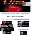
I'd get rid of the car manufacturer logos in the background. It's too convoluted.
The home page is very cluttered. Stick with one, maybe 2 fonts.
Knowledgeable, Experienced, Dediacted should go up top.
I would remove that animated image up top and stretch out your company name along the top along with that red Ferrari.
I would remove the Weather Channel and advertising banner.
I would list your links with their icons in a bulleted list; one below the other so it is easy to read and flows better. I like the icons, just list them better. I would add "Scedule an Appointment" as a link with an icon. Also when they click "Contact Us" you should have an appointment link there too.
Here is my layout:
A FINER DETAIL (centered)
image (centered)
list your name, phone number, e-mail in one line going across (centered)
KNOWLEDGEABLE - DEDICATED - EXPERIENCED (centered)
ABOUT US
FACTS & MYTHS OF DETAILING
DETAILING SERVICES
SPECIALS
CLIENTS
SCHEDULE AN APOINTMENT
CONTACT US
HOME
Spilchy
New member
SA Detailer
New member
I firmly believe every page should showcase YOUR WORK only, not a picture from somewhere else. You also state that you detail exotic cars but your galley showcases a Volvo and a Ford. Backup what you say with photos with your detail shop or mobile rig or even you in the picture. So many times a customer has contacted me after visiting my site and told me the reason they picked me over other sites because their pictures look like they came out of a magazine or they walked up to a vehcile in a parking lot, snap a photo and then say they detail it. I know this isn't true but this is what I hear. Just like Happe said, LOTS OF PHOTOS.
Also get rid of that Facts and Myth page, it's just wasted space and replace it with more pictues. Website clients have never asked me what products I use or what is the process for whatever, all they say is "Make my car look like those on your site"
Also get rid of that Facts and Myth page, it's just wasted space and replace it with more pictues. Website clients have never asked me what products I use or what is the process for whatever, all they say is "Make my car look like those on your site"
i think the site is too busy!! IMHO the links that have all the cars is kinda a lot and the way it moves up and down can strain the eyes even though theres very little in the background. ALso your pics in the gallery are good but they need to be bigger id suggest 1280 or something like that. Those pics are good shots they just need to be bigger for those nit picky clients that want to see everything. What i really love about the site was that thing you did with the weather now that was cool.
Id also suggest you can explain the benefits of being mobile, but dont tell everyone else your better than they are.... I dont know about the what products you use page cause im going to do that and although they might not care you never know if theyll ask...
Id also suggest you can explain the benefits of being mobile, but dont tell everyone else your better than they are.... I dont know about the what products you use page cause im going to do that and although they might not care you never know if theyll ask...
OK the site has a really elegant look to it. Most parts are well detailed. But this is a critique so lets get to the specifics. I will echo some things people already have said:
Text. Most of the text is a bit too small. The design is inviting but even with my good eyes you have to strain to see some parts. I'd suggest a 1-4px bump on some places.
All photos should be of your work since you are selling your work to begin with. From the front page on. If you need some photoshoping done on some photos to give it the same look as the pictures it will replace there are many designers out there that can do it for you, including myself (PM me if you wish).
Still on photos, you should have an extensive (e.g. 20 pic) gallery of your work per job that you show off. There should be some really good close up shots similar to the stock photography you displayed. Images should be 1024 on the larger images. I'd also suggest a gallery style display for each job.
The car brands on the front page are really not necessary. They just take up space on when you can sell your USP (Unique Selling Proposition). Remember this is your showcase to get leads.
I think it's a good start.
Envious Eric
New member
5 years later...LOL
please, no one else respond to this...
please, no one else respond to this...