Sully's Detailing: New Logo

Which font do you guys like

  • Picture 1

    Votes: 2 6.7%
  • Picture 2

    Votes: 24 80.0%
  • Picture 3

    Votes: 4 13.3%

  • Total voters
    30

sullysdetailing

New member
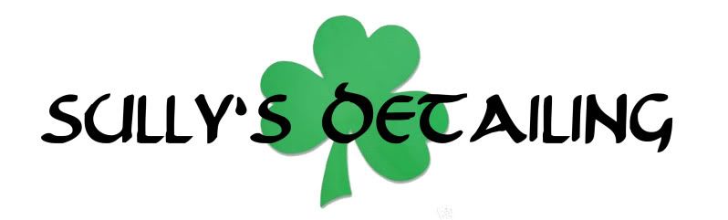
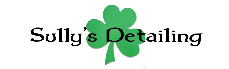
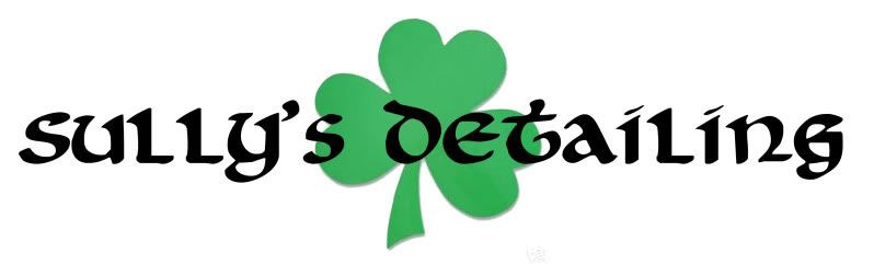
Ok here is a very very ruff design of what I had in mind with some different fonts

logo3.jpg

logo2.jpg

Logo1.jpg
 
The one I have now is More modern yes but on my T-shirts decals ect you cant see the detailing and turns away alot of up scale clients so I am making it simple, easy to read, and I through the shamrock in there because I am irish
 
The one I have now is More modern yes but on my T-shirts decals ect you cant see the detailing and turns away alot of up scale clients so I am making it simple, easy to read, and I through the shamrock in there because I am irish

That makes sense..
I would say #2 then.

BTW, who maintains your website, I love it.
 
Definitely #2, out of the available choices. You need a tag-line though.... something like "A show car shine that's more than the luck 'o the Irish" or "Kiss me, I'm your detailer" :lol2:
 
That makes sense..
I would say #2 then.

BTW, who maintains your website, I love it.

I maintain the site and add all of them pictures and blog post a firend of mine made the layout

Thanks for all the input guys, It is going to say South Florida's Premier Detailing Service under it
 
I agree on 2 and definitely a tag line. Maybe drop in your "South Florida's Premier Detailing Service" under your title like my logo is. See attached. Keep it simple for sure
 

Attachments

  • VIP Card.jpg
    VIP Card.jpg
    419.2 KB · Views: 10
Sharp and easy to read is the way to go. DJ's logo is very nice. :bigups

My first logo on my first detail truck was a joke. I cut my logo out of pin stripe and you had a real hard time reading what it said. It took me a couple of years to smarten up.

Some people (Dwayne) say I still am missing the boat by not actually having a logo like a muscular arm (Arm & Hammer style) but what I have now is clean and sharp and I get compliments on it all the time.

#2 gets my vote too. Although I think there's a better one than all three if you keep after it.
 
Of the three I like the middle one the best. The stand out item of number two is I could read the printing the first time. I had to study the other ones. If I cannot read a sign when it is on a computer not moving I wonder how effective a logo would be if it cannot be read easily?
 
Ha. I like it..none of the above.

What turned you on to the shield idea? I am not saying it is bad but it is such a departure for the "Celtic" approach.
 
I always liked your original logo, i am 47 years old and i know you were trying to cater to the older people but it worked for me!
 
Ha. I like it..none of the above.

What turned you on to the shield idea? I am not saying it is bad but it is such a departure for the "Celtic" approach.
Simple, Classy, Easy to recognize and I can just use the shield with the SD in it without the words and you will still be able to recognize it is Sully's Detailing
 
Back
Top