Opinions on my new logo...

Irkie500

New member
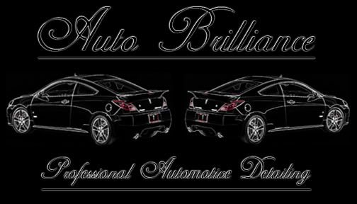
I whipped this bad boy up in about an hour and im pretty happy with it. However the picture of the G6 were pulled from google so that might be an issue, any alternative ideas for filling the space?


Also if that is anyone's business name on here please let me know and ill change it immediately, it just popped into my head and sounded good so I went with it.

auto-brilliance.jpg
 
My initial thoughts:


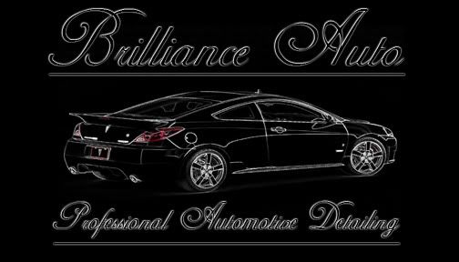
Brilliance Auto sounds more correct to me, but that's just my personal opinion.


I'd go for a single car image rather than dual, but I definitely like the way it sits on the black background.


In general, I'd personally make a few minor changes like I mentioned, but I do like the design a lot.
 
Here is the New VS Old


Personally I like the changes that were suggested it turned out looking much nicer.


New

auto-brilliance2.jpg


Old

auto-brilliance.jpg
 
I like the one car thing. try and keep it simple. Not sure if you ever heard the kiss phrase. keep it simple stupid. You want something that everyone knows when they see it. Let me give you example. what come to mind when you see golden arches? what about a white apple?
 
Irkie: The one car one looks sharp, I like it ! I think Brilliance Auto sounds a lot better too.


Barry: I'm drawing a blank, white apple ??
 
As Barry said, "K.I.S.S." and I'll leave you with this >>


NIKE_Swoosh.gif


KMART-thumb-965x754.jpg


If it looks good in B&W, it's going to be perfect in color. These guys have obviously done something right... follow them :).
 
Back
Top