My new business card

Richard Grasa

New member
I just had this card designed by Jeff Strong of Strong Keepsake Images, you can find him on Facebook. This guy is a top notch graphic designer, you can spend a couple hours looking through his work on FB, mostly all car related business cars, show boards, etc.


What do you think of the card? And yes, the car on the card was one I detailed :).



11-235-Rich-Grasa-GPBCv3pro.jpg
 
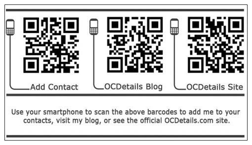
I like that layout a lot. Very nice. Have you considered putting a QR code on the back? I put three on the back of mine for people to add me to their contact list, visit my site, or visit the blog. They are super handy considering the number of smartphones are out there. If you can have something printed on the back of the card, then this is a good option.


Anyway, I really dig that design. I may have to copy it for my next round of cards. :eyebrows:
 
ExplicitDetails said:
I just had this card designed by Jeff Strong of Strong Keepsake Images, you can find him on Facebook. This guy is a top notch graphic designer, you can spend a couple hours looking through his work on FB, mostly all car related business cars, show boards, etc.


What do you think of the card? And yes, the car on the card was one I detailed :).


11-235-Rich-Grasa-GPBCv3pro.jpg


It's not bad but a little "busy" to me. I'm going with a less is more philosophy now after redesigning all my cards/letterhead etc..
 
I like it, Rich! Looks awesome. Are you trying to move away from the logo you're using in your forum avatar?


Jngrbrdman said:
Have you considered putting a QR code on the back? I put three on the back of mine for people to add me to their contact list, visit my site, or visit the blog.


Three? Wow, doesn't that end up being a bit cluttered? I've got one on the back of mine that has all of my contact information including the website URL so people can get to all of my stuff in one shot.


I've been waiting for my website to get done before fully adopting my new look, but here's a sneak peek at the cards I've been handing out for the last few months now:


Biz_cards_NEW.JPG


They were done by another graphic artist that works a lot with detailers and other car guys, Tony Moore (some of you may know of him from DetailCity/AutopiaForums).
 
I agree that one would probably be better. Get them to your web site. From there they should be able to access contact info or blog. Once they do it one time they can bookmark if they want to visit often.
 
Considering a recent study says that most people don't even know what that is, I think I'll probably just do one on the next one too. I really don't advertise at all and just maintain the same fifteen people all year, so I'm not too worried about it. I rarely hand out my card since I don't really have the time for more business, so I think my next design is going to be even more simplistic. Perhaps even made out of something other than paper. ;) Check out some of these cards. I want to go unique with my next batch like that. This is a good one for inspiration too.
 
Jngrbrdman said:
Considering a recent study says that most people don't even know what that is, I think I'll probably just do one on the next one too. I really don't advertise at all and just maintain the same fifteen people all year, so I'm not too worried about it. I rarely hand out my card since I don't really have the time for more business, so I think my next design is going to be even more simplistic. Perhaps even made out of something other than paper. ;) Check out some of these cards. I want to go unique with my next batch like that. This is a good one for inspiration too.


Heh... yeah I thought about doing a few like that for my "best clients" as well... but the Carbon Fiber cards I want would cost something like $20 a piece unless I bought a ton of them.
 
Ben@Autopia said:
Nice looking cards. The vertical design makes them extra unique.


Only thing missing is your avatar.:tongue2:


Thanks Ben. I went vertical because usually when I am done detailing a vehicle I'll leave a few of my cards in the cup holder in the center console/on the dash, and this way they're in the proper orientation when the client goes to pick them up and look at them.


As for my avatar, I'll eventually be using the new logo as my avatar :p
 
Shiny Lil Detlr said:
I went vertical because usually when I am done detailing a vehicle I'll leave a few of my cards in the cup holder in the center console/on the dash, and this way they're in the proper orientation when the client goes to pick them up and look at them.


Sometimes people's choices seem so random until you hear the reasoning behind it. When giving people advice I try to be as detailed as possible about why I do it a certain way, not just tell them what to do. The better people understand the why, the better prepared they are to adapt when necessary.


I always try to find a place to leave my cards where they will be the second thing the customer notices. (The first being how clean the car is.):buffing:
 
I like the vertical look as well, really catches your eye. I haven't looked into doing a QR code yet because my website needs a bit of work and I want to make it a bit more mobile friendly. I will look into getting that done before I order another batch of cards.


Charlie, my avatar is the only place I have that logo. That's one I was playing around with when I first went full time with detailing. I really don't have a logo, I mostly use the text like on my website.


Scotty, I know what you mean by the card being busy, but I wanted to get as much info on there as I could. My last cards were very minimal and was always wishing I had put more info on them, so I did with these.
 
Shiny Lil Detlr said:
Heh... yeah I thought about doing a few like that for my "best clients" as well... but the Carbon Fiber cards I want would cost something like $20 a piece unless I bought a ton of them.


They are really good to use for your best clients though. Sure they cost more, but they are cards that your client will never throw away. I've still got some fancy cards given to me by some people that I keep around. I've got one printed on a poker chip that is just too unique to get rid of even though I'll probably never use his service. It's just cool looking. :) Anyway, kinda spendy, but it makes your best customers feel special. Sort of like a credit card made out of titanium that works just as well as one made out of plastic, but it makes you feel special.
 
Strokes77 said:
There is a typo in the bottom right. I agree with the others as well that it is too busy.


Good catch!

I've contacted the designer to see if it's not too late to remove those two lines altogether to give a little cleaner look. Fingers crossed.
 
Here's the updated version, looks a bit cleaner.


Do you think the "Protect your investment and look good doing it" is good, or should I change that to "High Quality Auto Detailing" or something? Or do you think the "Auto Appearance" in my name gets it across good enough that I'm a detailer?


11-235-RGrasa-GPBCv32proof.jpg
 
Now that you mention it... Your current tag line seems like it would be more appropriate for a line of detailer's apparel. ;) Maybe something like "Your car deserves Explicit Details" or something like that. Something that promotes what you do specifically. I think a tag line is important, but sometimes it doesn't necessarily need to be on every media that you put out there, so maybe it could be left out altogether. It would look like this if you omitted it entirely.


card1.jpg
 
ExplicitDetails said:
Do you think the "Protect your investment and look good doing it" is good, or should I change that to "High Quality Auto Detailing" or something?


"Giving you Good Looks that Last."


Or do you think the "Auto Appearance" in my name gets it across good enough that I'm a detailer?


I've never really had a problem in that regard, but I did give a rough idea of what exactly I specialize in on my card. Still get the occasional person asking "How much for a paint job?" though and I have to explain that I don't do paint jobs, I save them.
 
11-235-Rich-Grasa-GPBCv3pro.jpg


card1.jpg


ShineShop said:
It's not bad but a little "busy" to me. I'm going with a less is more philosophy now after redesigning all my cards/letterhead etc..


My first (critical) thought as well. Then I started reading what these things all said, and could see why he might originally want to put all that stuff there. So . . . my current idea is to, sure, keep/make one single tagline for the front, I like the idea . . .


Then can you move the FB bit and web address to the back. My first thought is easy enough, have the two lines centered, on white background. Or you could come up with some other asymmetrical design instead, of course. I do not know how much that would more it would cost to use both sides, but I think that would be pretty nice.


I think a vertical layout is fine, but my personal preference is for the horizontal. However I may keep my cards, in a rubber band, in my wallet slot, etc, I think I just have a preference for that.
 
Had some changes made and this is going to be the final design. I would put the website and FB icon on the back, but that costs extra and coming into the winter months I need to save as much $ as possible.


11-235-R-Grasa-GPBCv4PROOF.jpg
 
Back
Top