Mobile Detailing Logo

TN9thSi

New member
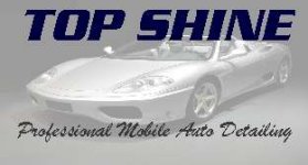
Since I'll most likely be starting a registered business doing mobile detailing this spring, I thought it would be a good idea to throw together a logo to put on business cards, flyers, etc. I had a friend and co-worker design one for me which looked nice, but was a little too generic. Here's what a few hours in Photoshop produced. I wanna replace the embossed Saleen Mustang with just a white outline of some car. If you're familiar with Orange County Choppers' logo, you'll know what I'm taking about. Anyway, here's the first draft. Still need some tweaking, but I just wanted to get some feedback from you guys. Let me know what you think.


13446topshine.jpg
 
Just a though but here is Florida anyone with a garden hose call themselves mobile auto detailers. If you use any of the procedures discussed here you are WAY better and should somehow reflect that on your cards. Maybe " Mobile Professional Detailer" or something that has you shine above of rest.
 
Thanks for the tip, roaringmouse. Like I said, it's just a rough draft right now.


Scott, Thanks, I plan to use that as the front of the business card with all the services and contact info on the back. I may put a phone number on the front somewhere just in case people don't realize there is a back side to the card.
 
umm. i'd say instead of an emboss effect, goto some type of outline or 'cartoon' filter for the mustang, so its lines will show up better if its a 2tone printout.


just a thought.
 
As stated in my post, I plan to use an outline of some kind, just not sure exactly what yet. I'm gonna mess around with it some more tonight.
 
I do not like it. I had to pass the logo design proccess.


I studied for 2 months and read a lot about it I try to be constructive.


A hint: Your logo (the car) does not show shine. Think about it, with topshine name, your logo car DO NOT SHINE. What a contradiction, isn´t it?
 
What do you suggest, aqua? Wouldn't the whole thing look odd if I had a photo of a real car on the card? I don't know what would look the best. Of course this is my first try at designing a logo.
 
Personally, I really liked the way your letters sort of glowed on your first card. How about a start burst effect. Here is something I found with a quick web search.
 
I like the "burst effect" but with the way my text is now, I don't think it would look all that great. Perhaps a thicker, fuller font with that effect applied would look nice. I like what I have because it's streamlined and simple, but not overly dull and boring. Still playing around with it though. Thanks for the ideas.
 
Back
Top