Feedback on this logo please

EBPcivicsi

GOT PREP?
This is the first draft--I know that I want to change the "w" as I feel it's too hard to read, I might even change the whole font.


Any input would be greatly appreciated--TIA


I have thick skin--fire away. :D


tn_LOGO.jpg
 
I think if thats the theme your going for then it looks great. You have to think about little things though, like replicating that small for a business card or die cut vinyl . Its pretty busy and may be hard to brand. It doesnt really say any thing about detailing, but that might not matter. Its pretty sharp though. Sorry that probably doesnt help at all.
 
cj99si said:
I think if thats the theme your going for then it looks great. You have to think about little things though, like replicating that small for a business card or die cut vinyl . Its pretty busy and may be hard to brand. It doesnt really say any thing about detailing, but that might not matter. Its pretty sharp though. Sorry that probably doesnt help at all.


Yeah, I sort of wanted to go in the opposite direction of the typical "guy with pressure washer", or the "bucket of suds" logo's. I just wanted it to have an "old world service-based feel" to it, if that makes sense. I just want it to be classy...


Thanks guys, keep it coming!!
 
Very high end classy logo. It depicts a very high end, luxurious service, and the name, "word of mouth," conveys that your work is on an entirely different level than the other guys.


Greg
 
hooked said:
Maybe flip the top-left handprint so that the thumb is on the right to help with the symmetry?


seconded


The only thing that barely bothers me is that the shield edges are so precise, where as everything else isn't. Looks great though!
 
If it works for your area then I think it's nice and very unique. It definately portrays class. It's interesting to see how different parts of the country can have different logos work for them. In my area, I don't think I could pull that logo off because of the Hispanic population that have logos like that and their last name in lettering like that. I would just be looked at as another Rodriquez going down the road with my tinted windows. haha
 
Joshua312 said:
If it works for your area then I think it's nice and very unique. It definately portrays class. It's interesting to see how different parts of the country can have different logos work for them. In my area, I don't think I could pull that logo off because of the Hispanic population that have logos like that and their last name in lettering like that. I would just be looked at as another Rodriquez going down the road with my tinted windows. haha


They use old world English fonts for their names? :D


Thanks guys!!


One thing about the hands-- I *believe* that it changes the meaning if you turn it--will check it out. I am big on symmetry myself. :D
 
While the logo is very nice it really has nothing at all to do with auto detailing. IMO it is too large and the most important information (Auto Detailing Services) is the smallest of the three. If you were to put that on the side of a van or advertise in the local paper the reader's eye would be drawn to the crest and not to the fact that you are a detailer, they might think you're a dry cleaner or caterer as they may not read everything.


Try showing it as it is to someone for two seconds and ask them what they just saw and what it was for.


If you like the crest why not reduce it's relative size and change the hands and the Fleur de Lis images to something automotive?
 
DFTowel said:
While the logo is very nice it really has nothing at all to do with auto detailing. IMO it is too large and the most important information (Auto Detailing Services) is the smallest of the three. If you were to put that on the side of a van or advertise in the local paper the reader's eye would be drawn to the crest and not to the fact that you are a detailer, they might think you're a dry cleaner or caterer as they may not read everything.


Try showing it as it is to someone for two seconds and ask them what they just saw and what it was for.


If you like the crest why not reduce it's relative size and change the hands and the Fleur de Lis images to something automotive?


Great idea--THANK YOU!!


I wasn't too concerned with the logo *not* being automotive related, or showing anything about detailing because I always imagined that it would be accompanied by other pictures, text, etc. In other words for an advertisement you might see a picture of a white glove holding a q-tip, cleaning out a vent, then the logo above that. Does that make sense? Should I rethink that?
 
I like the logo. I agree, the auto detailing part should be larger. I think the image actually gives nice imagery with regards to detailing. The shield represents the protection you give to the autos, while the lions are like the elements that attack the paint. Maybe instead of the hands and the other image in the shield, you could put cars/trucks.
 
I actually had a coat of arms rough draft drawn up to submit to my graphic designer. I was going to use it for the back of a tee shirt.


It would be cool if you could make the shield more recognizable. Similar to what Porsche and Ferrari have as their logo. Maybe leave 2/4 of the spaces with artwork and add images that relate to detailing in the other 2. That way the shield will stand out without the other artwork.
 
Noting that I know a little bit about the folks in your area (from high-school dropouts to PhDs):


At the risk of sounding like a real downer :o 
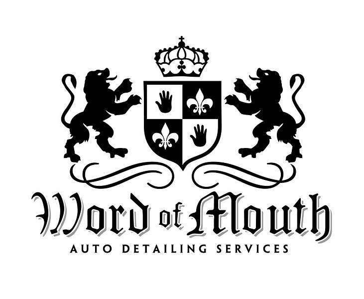
much as I like the Olde Englishe font and crest idea, I don't think it's best for this application. As mentioned it might have some negative connotations to some potential customers or be something that they won't read/get at a glace. It's a fine line between classy and hoity-toity for some folks too, silly as I find that, and it might be something that your target demographic (I'm thinking Memphis, specifically) might not relate to.


I'm with Leo, work toward something that *the typical customer in your area* will both relate to and assimilate quickly, even if you do expect them to look at it a lot longer.


Memphis is Memphis ;) Gotta play to your audience. I'd try to think up something that'll click with the people you're after.


You're trying to say "better than a carwash, better than a crappy "detailer", worth paying for as opposed to doing it yourself" right? How do you get that across :nixweiss
 
Accumulator said:
You're trying to say "better than a carwash, better than a crappy "detailer", worth paying for as opposed to doing it yourself" right? How do you get that across :nixweiss


Exactly, I was thinking that the crest/coat of arms would do that. I guess it's back to the drawing board. :D
 
ebpcivicsi said:
.. I guess it's back to the drawing board. :D


Heh heh, well, I don't envy you this job...it might be tricky to come up with the right thing, but it could sure pay off if you nail it just right ;)
 
If you are looking for just an image and not necessarily print materail one suggestion would be dropping a metalic shield behind the text. Just a suggestion, but it might be to overwhelming. That's what's fun with graphic design. Trying different things.
 
I think you're selling yourself short by claiming you are a detailer. You really should say automotive paint refinisher. The only problem is that not many people will know what an automotive refinisher does. Then again, most people think of a ham & egger wash and wax as detailing!


Also, Although the name is great, I think it may look funny ifyou do advertise or even on the side of your work vehicle. Many people may wonder if it's word of mouth....why am I seeing it on the truck, paper, etc.


Just some ideas off the very top of my head may be:


Reflections Detailing or whatever and the Reflection can be written with a reflection of itself underneath


Perfect Gloss


Can't Touch This (Just kidding here but fitting since your quality is exceptional)


180 Detailing (As in the 180 degree tranformation you do to the cars)


Just random thoughts, not saying you should change the name, but just offering a lil insight.
 
Back
Top