Navigation
Install the app
How to install the app on iOS
Follow along with the video below to see how to install our site as a web app on your home screen.
Note: This feature may not be available in some browsers.
More options
Style variation
You are using an out of date browser. It may not display this or other websites correctly.
You should upgrade or use an alternative browser.
You should upgrade or use an alternative browser.
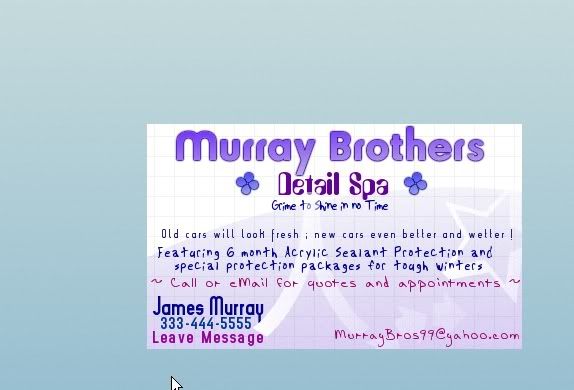
Business Card sample - Opinions please ?
- Thread starter papi_jay
- Start date
of course the 6 month sealant is 3 coats of Z2pro/ZFX + another 3 coats during the next week followup detail w/ VM nuba
Winter package I think I'll do Zaino + collinite 845 or 476 over top 2 coats
Plus all chrome and such sealed with AIO + collinite or Vanilla nuba
sound good ?
Winter package I think I'll do Zaino + collinite 845 or 476 over top 2 coats
Plus all chrome and such sealed with AIO + collinite or Vanilla nuba
sound good ?
imported_mahd
New member
This is of course my opinion and meant as constructive criticism but it is too busy looking and you need to keep with a consistant font style. You may want to use the back of your card for extra information you want to provide.
Thank you mahd . I would like to do the reverse side for additonal info , but need to keep budget low as I am in college currently and money is Tight with a capital T .
Single sided cards will keep cost down and since my card printer can do prints directly from the program I use , I figured fool with it awhile and see what I come up with and send them my final design .
Too busy looking I thought so too
Anyone else
Single sided cards will keep cost down and since my card printer can do prints directly from the program I use , I figured fool with it awhile and see what I come up with and send them my final design .
Too busy looking I thought so too
Anyone else
In my never to be humble opinion.
(A) I would stick with only 2 fonts. One for your heading (business name) and that one can be creative, wacky, bold, ect.. Second font for the other info.
(B) For other info font pick a clear, crisp, clean font, not one that will cross your reader's eyes.
(C) Too wordy, try this: "ask about our protection packages"
(D) Also, just come up with one "catch phrase" maybe 2 lines long max.
(E) your name & contact info at the very bottom of the card
COMPANY NAME
CATCH PHRASE
PROTECTION PCKG
CONTACT INFO
CONTACT INFO
Here's another idea. I'm sure you would like to highlight the packages you have (winterizing, after winter ect) so why not put all that on a flyer? You'll have plenty of room to list your various packages and detailing info. and you can simply staple your biz card to that flyer.
Hope I was able to help.
a73elkyss
Still learning
While I'm pretty new to this great site, I hope you don't mind me chiming in on your card. I am going to have to agree with the others that it is to busy and the fonts "strain" my eyes.
You have a good message, but I would simplify and try to catch the customers eye. Then go with the flyer w/ additional info like the other members said.
Best of luck. This is a great forum for feedback before you hand out cards to your customers.
You have a good message, but I would simplify and try to catch the customers eye. Then go with the flyer w/ additional info like the other members said.
Best of luck. This is a great forum for feedback before you hand out cards to your customers.
rollman
Professional Detailer
Oh man my head hurts ! Reading that gave me a headache , don't try to fit a flyer into a business card. Stick with 2 fonts that are legible to everyone (both old and young eyes) Keep it simple ! . Good luck :buffing:
IMO leave off the thing about the sealant, instead of the "you may not need a paint job and new cars will look better" maybe something like "Make you old car look new again, and you new car look even better," or just leave it off all together...you've already got a catch phrase with the grime to shine. Don't put leave a message...it makes you sound like your kind of a backyard detailer. You don't want this even if it's true. Just use the business name on the answering machine and tell them to leave a phone number and you'll get back to them ASAP.
This is getting really picky, but I don't really that there are different fonts...I'd use one or two with the name being one and the rest being something else. I also don't particularly like the two fonts that Murray Brothers and Detail shop are in...they seem to me to be kind of bubbly/little kiddish and would be suited more to a toy store or something.
Please don't take any of this the wrong. These are just my opinions and feel free to follow any or none of it.
Another option is a double sided card...they cost a bit more, but it would be an option if you feel that the extra info is necessary.
I am not taking any of this personal or taking it wrong . Constructive criticism is great and exactly what I need !
Thank you
As far as the " Leave Message " thing goes , I have a voicemail which can not be personalized , only a brief message of what phone # was reached and to leave a message .
Many people hang up if they want to . I want to let it be known leave a message even if you think you've reached a " generic mailbox "
I dunno . :-(
Edit #3 on Page #1 everyone .
Terran I feel I need to leave that on the card to let it be known that the sealant package really is so much more durable than a simple wax .
Many people love their new cars , but hate having to wax bi-weekly or what not to protect it and have it looking proper , so I think that's a good point that really stands out to those not " in the know "
No ?
Even if they dont know what I'm talkign about realizing that they will get 4-6 month of protection is re-assuring .
imported_truzoom
New member
Unique fonts on the title are fine, as the font size is usually larger so its easier to read, but for the rest of your text you may want to go with a time-tested font like Times New Roman, Arial, Georgia, or Courier New. The current design you have looks trendy, and it would probably catch the eye of young people, but a professional, straight-forward design with less colors would mean business.
A business card shouldn't advertise, that's what flyers and other promotional material are for. A business card should simply tell people your company name and contact details, as you'll only really be handing them out to people who know what you do.
As others have said, stick with a max of two fonts, and a max of two colours. Anything else simply detracts from the impact the cards makes, and also, IMO reduces the professionalism.
Not saying mine is perfect, but here it is anyway:

Ben
As others have said, stick with a max of two fonts, and a max of two colours. Anything else simply detracts from the impact the cards makes, and also, IMO reduces the professionalism.
Not saying mine is perfect, but here it is anyway:
Ben
I tried intentionally to make it be more jazzy and not so business like for two reasons though .
1.) I am not an actual business yet . I worked as a detailer for 3 years , and am doing this on the side
2.) I will be handing out many of these at the college I attend . Many college students like to uphold an image about themselves , and I figure your car says something about who you are also .
I am trying to " catch their eye " with the jazzy card , and not be so business oriented
Like what was already said, only 2 fonts 1 for the name, the other for the info. I'd choose arial for the regular text. Personally I don't like anything too colorful either, when I look at the card it come's off young, fun, and careless, not businessy and responsible. You don't have to keep it white and black but maybe a lil more business oriented. I think older customers wouldn't take the card seriously, although it may appeal to younger women...Are you trying to be the detailing version of 'Loverboy'...lol
Just some constructive criticism, don't take anything I say to heart.
Just some constructive criticism, don't take anything I say to heart.
I'm kind of glad you said that AudiLikeA4 - I am good with MANY ladies at school , so they might just be a large majority of my customer base .
Most of them try to keep the " I am sooooo cute " attitude as well , so me throwing the " your car's beauty reflects yours " line at them might work some pretty strong magic into their egos ..
This would just be a sample pack anyways , not the real deal card order . 250 cards glossy rounded corners
Most of them try to keep the " I am sooooo cute " attitude as well , so me throwing the " your car's beauty reflects yours " line at them might work some pretty strong magic into their egos ..
This would just be a sample pack anyways , not the real deal card order . 250 cards glossy rounded corners