Hey all, I've just started some ideas for my site, and started on a banner tonight, heres one of a few I came up with roughly. I do plan to have a couple more buttons on it, and might change some things around. I find that my logo is hard to work with as it seems that anything but a white background behind it doesn't look too great. Anywho, let me know what you think of it so far, and any improvements I could make, or ideas for other stuff you have.
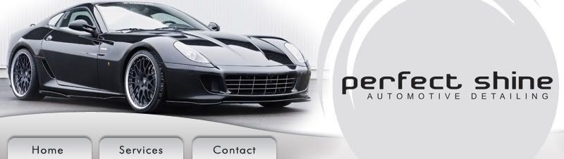

") I wanted to use a photo of a hot supercar that had a good colour scheme that would work with my logo and layout.
I wanted to use a photo of a hot supercar that had a good colour scheme that would work with my logo and layout.

