First Biz card attempt

Bodezafa

New member
Houseofwaxxcard1-1.jpg
 
Looks pretty good. Not my choice in word font, but it's your company. Small things I would add are; maybe add a title under your name like "owner/founder", i would also include a website if and when you do obtain one. I'm not crazy about the R8 in the background, seems there's just a lot going on for a business card.
 
I saw this thread as it was first posted. I held off waiting to see what others might say. There hasn't been a lot of movement on the thread so maybe this post will give it a bump.

I think you're trying to word play on the "House of Waxx" portion of the card so I believe I understand where you're headed with the creepy font. That said, I think that a cleaner font will stand out better, you're plenty large on the business and name font, perhaps too large. The picture should be secondary but I don't get to it all because of the font size. I also believe that the colors are a bit too close between the font and the picture. I would move towards contrasting colors rather than complimentary colors between the background and the font. I don't really know how to describe what I'm seeing. The font stands out yet it blends in, I think it's just too close on the color wheel. I guess what I'm saying is the font is large but I have to work to read it.

You might be two siding this card and if so disregard this comment but I think you need more information displayed, location, website etc. A suggestion might be to change the borders to white and include your info in a smaller font on the bottom. The whole card reminds me of Halloween. If that's where you are trying to go, you're there. Sorry if this comes across too negative, it's a good first try. Very few people get it right the first time.
 
Its pretty busy that's for sure. I would stick with one font and not the one you are using for the "House of Waxx" in BC less is more and something that is easy to read.
 
I'm not liking the way 'Auto Detailing' sits on top of the car, I think you should have more of a gap between the two. I would even go as far as making the picture smaller so you have a black background for the letters. Sometimes little things like these go a long way in the business world.
 
Shiny, Im about 2 hours south of you in Morenci. Right on the Ohio border.
I saw this thread as it was first posted. I held off waiting to see what others might say. There hasn't been a lot of movement on the thread so maybe this post will give it a bump.

I think you're trying to word play on the "House of Waxx" portion of the card so I believe I understand where you're headed with the creepy font. That said, I think that a cleaner font will stand out better, you're plenty large on the business and name font, perhaps too large. The picture should be secondary but I don't get to it all because of the font size. I also believe that the colors are a bit too close between the font and the picture. I would move towards contrasting colors rather than complimentary colors between the background and the font. I don't really know how to describe what I'm seeing. The font stands out yet it blends in, I think it's just too close on the color wheel. I guess what I'm saying is the font is large but I have to work to read it.

You might be two siding this card and if so disregard this comment but I think you need more information displayed, location, website etc. A suggestion might be to change the borders to white and include your info in a smaller font on the bottom. The whole card reminds me of Halloween. If that's where you are trying to go, you're there. Sorry if this comes across too negative, it's a good first try. Very few people get it right the first time.
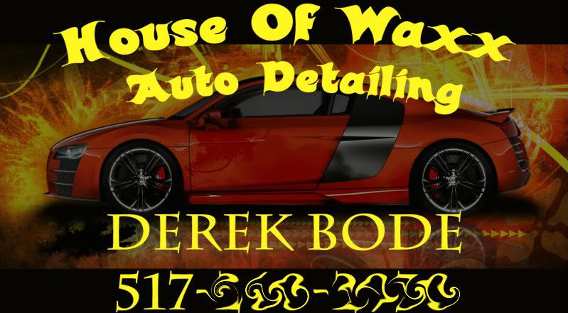
Gearhead, thanks for the input. I did it with photoshop and the font is called candle.. lol I used a color that was already in the picture for the font color, thats why it kinda blends. Ill work on font type and color and probably the back ground image. I dont have a web site as of yet. Im trying to work a trade for one to get made.
 
For some reason I think business cards should say something like "serving the <city or country> with some words like "providing superior detailing services for <area>....
 
For some reason I think business cards should say something like "serving the <city or country> with some words like "providing superior detailing services for <area>....

Not a lot of room to put that on a card IMO. I hand my cards to anyone that I want to detail for. Those people are specific to my location. Now if this was a fixed location I could see that being useful
 
Not a lot of room to put that on a card IMO. I hand my cards to anyone that I want to detail for. Those people are specific to my location. Now if this was a fixed location I could see that being useful

It'll cost more to make the card, but the back of the card is a great place for pricing/services offered, details, or catchy phrases.
 
I think Mel Cand Mike P alluded to this elsewhere, your business card is what remains in potential clients hands after you hand it to them so not doing some educating / selling is just a possible missed opportunity.

Your customers may remember and know everything but why take a chance. ;)
 
It'll cost more to make the card, but the back of the card is a great place for pricing/services offered, details, or catchy phrases.

That's why a simple web address would work here. It might just be me, but busy cards and two sided cards seem confusing. Let your website do the selling not the BS.

Again this is just how I feel about cards in general and I've had plenty of them in my career;)
 
There is room for a sales pitch if you remove your name or resize it to small.

People are more interested in what they're getting, not your name.

Just saying the truth about buyers.
 
This was posted on Autogeek but shows you can get a lot of info on the card. I am not saying this is the best designed card but shows what you can add.

BusinessCard.jpg
 
I like this much better too. Are you going to put anything on the rear such as the services offered?
 
The second draft looks good. I always recommend getting the UV coating. The colors end up better and the card holds up longer.
 
Back
Top